AAKAAR
YOUNG DESIGNERS INDIA
Industrial design // experience design

A chess set that captures the essence of modern India, but doesn't cast(e) it's past aside.
Industrial design
Narrative development
Concept development
Visualization
The team in this project consisted of:
Udhbav Bharadwaj : Team Lead
Ritwiz Sharma : Senior industrial designer
Shubham Modgi: Industrial designer
Aditya Mehra: Industrial designer.
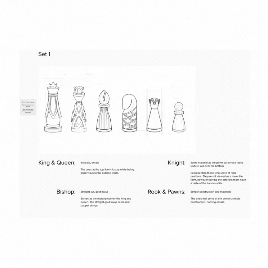
The brief given to us was to capture the essence of modern India and the Indian experience and infuse it in a chess set. While it was an immense task to capture one of the most diverse countries in a chess set, we didn't want to leave anything on the table. Our exploration started in the deepest reaches of the Indian subcontinent, from the play between light and shadows, to materials like terracotta and marble. In the background, a narrative of class and hierarchy plays an important role in visual, structural and material choices, just as it does in the game of chess. These narrative devices were intentionally kept veiled under a layer of glamour to drive home that those who look deeper, will always find meaning.
This project was supported by Young Designers India, in partnership with TEAGUE and Figma. I'm incredibly grateful to be a part of this project as it has allowed me to work with amazing people from a wide range of backgrounds, and it has, in turn, made me a better designer.
The process
The entire process was documented on a mural board from concept generation to development. I will highlight some key decisions in the process below.

Between darkness and light
After the initial exploration phase was over, Jali emerged as a distinct and fascinating design direction for several compelling reasons. The intricate latticework of Jali not only evokes the mesmerizing interplay of light and shadow, but also serves as a visual metaphor for the themes woven into India’s cultural traditions—from the festive illumination of Diwali to the age-old stories of the Mahabharata and Ramayana, where light signifies knowledge, hope, and the victory of good over evil. Jali’s presence also subtly signifies hierarchy and class, as these ornamental screens have historically adorned palaces and havelis, meticulously crafted for the elite and serving as a boundary between the privileged and the outside world. Integrating Jali into the chess set creates layers of resonance: it speaks to exclusivity and social stratification while also providing a surface for storytelling, inviting viewers to consider the barriers and connections that shape Indian life. The decision to include Jali thus elevated the project beyond mere aesthetics, making each move on the chessboard an embodied reflection of India’s rich cultural legacy.

Material poetry
After the overarching theme was established, we started looking into the concept and connecting dots. Diwali, the festival of lights was a perfect fit for the narrative. Diwali is celebrated to commemorate the triumph of good over evil. In other terms, we light up the night with diyas to symbolize that darkness lost.Diyas are an integral part of diwali, and so is the material diyas are made of, terracotta. A material that has lasted centuries and become synonymous with culture and ritual. It reflects India’s ancient craftsmanship, seen in traditional pottery, temple art, and folk sculptures that connect to rural and historical traditions. Bronze and brass, on the other hand, evoke the grandeur of Indian temples, classical statues, and ceremonial artifacts, symbolizing durability, luxury, and timeless artistry. Together, these materials balance earthiness with refinement, creating a tactile and visual blend that conveys both India’s grounded traditions and its enduring cultural elegance.Using terracotta and bronze/ brass for an India-inspired chess set thoughtfully weaves the narrative of hierarchy and class into its very design, which is essential for authentically telling India’s story. Terracotta, historically accessible and crafted by local artisans, represents everyday life, grassroots creativity, and the working classes, while bronze and brass evoke images of palace artifacts, religious icons, and ceremonial regalia traditionally reserved for royalty and the elite. This deliberate contrast in materials mirrors the layered social fabric of India, where stratification that's rooted in history, caste, and wealth, continues to shape our lives and societal standards.

A box of joy
Packaging the chess set like a mithai box felt like a natural fit, drawing on the everyday joy and warmth that sweets bring to Indian celebrations. Mithai boxes are instantly recognizable and bring back memories of family gatherings, festivals, and small acts of sharing happiness. By using this familiar style, unboxing the chess set becomes a cheerful and inviting moment, much like opening a box of sweets with friends and family. This choice makes the set feel personal and approachable, connecting it to real moments of togetherness and celebration found throughout India.


Between darkness and light
After the initial exploration phase was over, Jali emerged as a distinct and fascinating design direction for several compelling reasons. The intricate latticework of Jali not only evokes the mesmerizing interplay of light and shadow, but also serves as a visual metaphor for the themes woven into India’s cultural traditions—from the festive illumination of Diwali to the age-old stories of the Mahabharata and Ramayana, where light signifies knowledge, hope, and the victory of good over evil. Jali’s presence also subtly signifies hierarchy and class, as these ornamental screens have historically adorned palaces and havelis, meticulously crafted for the elite and serving as a boundary between the privileged and the outside world. Integrating Jali into the chess set creates layers of resonance: it speaks to exclusivity and social stratification while also providing a surface for storytelling, inviting viewers to consider the barriers and connections that shape Indian life. The decision to include Jali thus elevated the project beyond mere aesthetics, making each move on the chessboard an embodied reflection of India’s rich cultural legacy.
Material poetry
After the overarching theme was established, we started looking into the concept and connecting dots. Diwali, the festival of lights was a perfect fit for the narrative. Diwali is celebrated to commemorate the triumph of good over evil. In other terms, we light up the night with diyas to symbolize that darkness lost.Diyas are an integral part of diwali, and so is the material diyas are made of, terracotta. A material that has lasted centuries and become synonymous with culture and ritual. It reflects India’s ancient craftsmanship, seen in traditional pottery, temple art, and folk sculptures that connect to rural and historical traditions. Bronze and brass, on the other hand, evoke the grandeur of Indian temples, classical statues, and ceremonial artifacts, symbolizing durability, luxury, and timeless artistry. Together, these materials balance earthiness with refinement, creating a tactile and visual blend that conveys both India’s grounded traditions and its enduring cultural elegance.Using terracotta and bronze/ brass for an India-inspired chess set thoughtfully weaves the narrative of hierarchy and class into its very design, which is essential for authentically telling India’s story. Terracotta, historically accessible and crafted by local artisans, represents everyday life, grassroots creativity, and the working classes, while bronze and brass evoke images of palace artifacts, religious icons, and ceremonial regalia traditionally reserved for royalty and the elite. This deliberate contrast in materials mirrors the layered social fabric of India, where stratification that's rooted in history, caste, and wealth, continues to shape our lives and societal standards.
A box of joy
Packaging the chess set like a mithai box felt like a natural fit, drawing on the everyday joy and warmth that sweets bring to Indian celebrations. Mithai boxes are instantly recognizable and bring back memories of family gatherings, festivals, and small acts of sharing happiness. By using this familiar style, unboxing the chess set becomes a cheerful and inviting moment, much like opening a box of sweets with friends and family. This choice makes the set feel personal and approachable, connecting it to real moments of togetherness and celebration found throughout India.

The pieces
The soldier
The soldier starts off small and vulnerable, moving slowly and carefully. But with patience and the right choices, it can become the most powerful piece on the board. Like a seeker on the path of dharma, its true strength only shines through perseverance and transformation.
Insights:
Coming up with this design was perhaps the hardest as the line between it being distinctive enough while being the most understated piece on the board. While doing variations for this pieces, we came up with the idea of inverting the spherical head to create a spherical cutout instead. This gave the pieces a very distinctive look while keeping it immensely recognizable to the player, looking down on the board. This also allowed us to bring in a great interaction for when the piece reaches the end of the board and transforms.
The lack of ornamentation and terracotta construction draws from it's identity as a piece that's often sacrificed to save more 'valuable' pieces


The chariot
The Chariot stands for grounded strength. It starts quietly in the corner but moves across the board with clear purpose and calm determination. It symbolizes a steady presence, memory, and deliberate power. While others rely on speed or cleverness, the Chariot’s strength comes from patience. It reminds us that stability can be just as powerful as force.
Insights:
The top of the piece is carved with four controlled cuts, creating curves that rise and fall in a soft rhythm. This gives the surface a feeling of movement held in tension. Underneath, a hollowed space reveals a smooth, rounded floor, a quiet nod to the vimanas of the Ramayana.
A bold bronze ring wraps around its outer body, giving it a sense of strength and continuity. Cut into the ring are four star shapes, turned 45 degrees from the cuts on top. They don’t face the direction the piece moves. Instead, they look outward, like the eyes of the chariot. This offset alignment creates a subtle tension, a feeling of readiness like the energy in a wheel just before it turns.


The horse
The Horse moves not in straight lines but in smooth arcs, always alert and ready. It doesn’t charge ahead blindly but senses openings before they appear, acting in the moment between thought and motion. It’s clever and quick, moving with a kind of restless energy that’s hard to predict.
Insights:
This piece brings together terracotta and bronze in a way that feels both ancient and modern. The body is a solid cylinder of terracotta, carefully shaped with a subtle but clear horse profile. Next to this warm, earthy core are two bronze plates, each cast with the traditional lost wax method. A four cornered star is embossed into the bronze at the eye. This detail was designed to catch your attention and give the piece a strong, symbolic anchor. We wanted to find the right balance between a familiar shape and something original. The form hints at a horse and armor without being a cliché. The knight feels good in your hand; it is solid and inviting. We designed it not just to be looked at, but to be held.


The elephant
The Elephant stands for steady presence. It doesn’t rush forward but watches carefully from the edges, always grounded and aware. Instead of reacting quickly, it waits patiently, sensing the flow beneath the surface before making its move.
Insights:
This piece isn’t just a new version of the bishop. It’s a return to what the piece once was, long before Western standards changed it into something disconnected from its origins. In the Indian tradition of chaturanga, this piece was an elephant, a symbol of strength, foresight, and deliberate movement. This idea led us to the Mishra Yantra, an ancient astronomical instrument for tracking celestial time. It gave us more than just a shape; it gave us a way of thinking, one centered on rhythm, alignment, and layered observation.
The bronze core at its heart is dense and elemental, like the fixed gnomon of a sundial that measures, anchors, and remembers. A terracotta shell was poured, shaped, and aged by hand to form a body that feels tactile and alive. It always holds the potential to crack, breathe, or show the marks of time. This contrast speaks to a permanent core surrounded by an impermanent shell.
This is not an elephant seen in profile. This is the elephant as a presence felt across the board, grounded in rhythm and moved only when the moment is right.


The queen
The queen’s tiara features a delicate hollow carefully shaped to mirror the jewel at the front of the king’s crown. This connection is more than decoration; it’s a symbol. One piece represents presence while the other holds potential. It reflects the idea that true power is shared and balanced, not taken alone. The queen was not designed as a smaller or softer version of the king. Instead, she is a counterpart whose strength comes from complementing his. Where the king wears the jewel, the queen carries the space that gives it meaning and strength.


The king
For the king, we chose to move away from the typical European crown. Instead, we drew inspiration from the headpieces worn by Indian rulers, especially the turbans and sarpech of Mughal emperors, Punjabi maharajas, and Sikh leaders. These weren’t just ornamental; they were deeply symbolic of earned power, lineage, and responsibility. Where a Western crown is often about divine right and inherited rule, the Indian turban is tied, not placed. It signifies a role accepted with weight, not just granted by birth.
From a design perspective, these headpieces gave us a layered structure to work with. We used radial curves, central spines, and vertical lift and abstracted them into a silhouette that is both regal and culturally grounded. This allowed us to craft a king that feels local in its authority, reflecting power not through height or symmetry, but through presence, heritage, and quiet command.


The end of the soldier's journey
The hollow space in the pawn was designed with its final journey in mind. When a pawn reaches the other side of the board, it earns its transformation. Instead of swapping it for a new piece, a single jewel-like sphere is placed into the cutout, crowning the pawn’s achievement.
This sphere has the same star symbol seen throughout the set. If the star faces up, the pawn becomes a Queen. If the player needs another piece, the sphere can be turned over to hide the star. This acts as a quiet signal of its new role while keeping the look of the set consistent.


The kingdom


The gift


The battlefield


The showcase

